
A budgeting tool that meets stressed students where they are.
College students often ignore their finances until something breaks. I designed a low-stakes tool — no account, no strict budget — that makes the link between earning and spending visible.
Role · Solo UX — research, persona, scenarios, wireframing, prototyping, usability testing
The problem
Students face real expenses and constant stress but rarely keep a strict budget — so a tool that demanded one would just get ignored.
The challenge was to make the link between earning and spending visible without friction.
Research
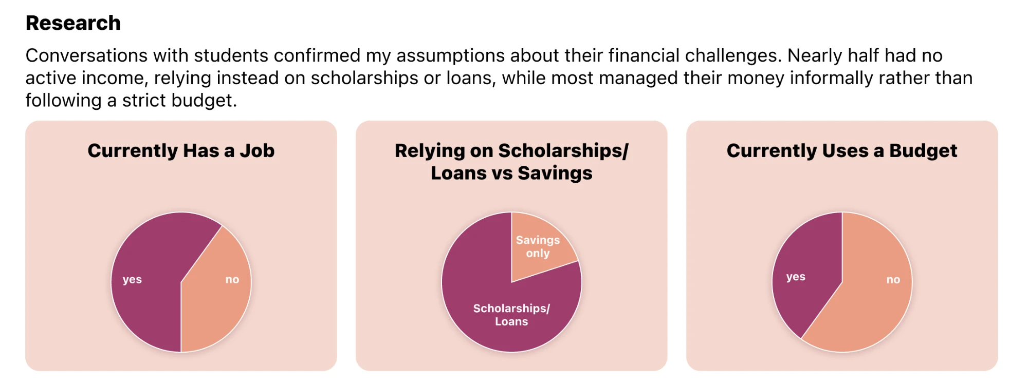
Interviews confirmed the pattern: roughly half had no active income (relying on scholarships, loans, or savings), and most managed money informally.
That told me the tool had to be low-commitment from the very first screen.
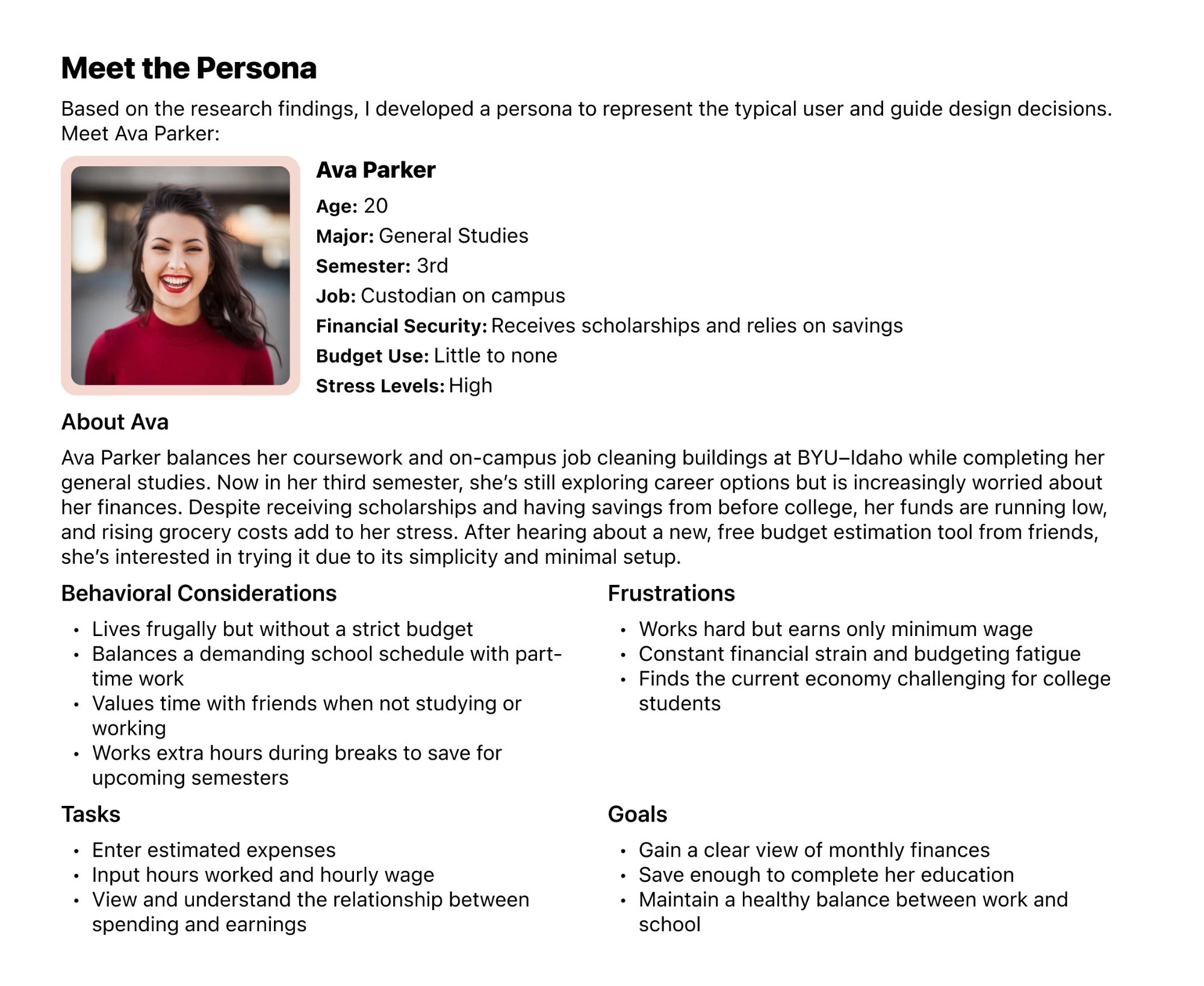
Persona — Ava Parker
20, general studies, on-campus custodian, high stress, little-to-no budget; frugal but unstructured, worried about money running low.
Ava became the gut-check for every decision: would this feel simple enough that she'd actually use it?
Design & iteration
Four rounds — paper, two low-fi, then high-fi — each tested with 3–5 new participants. Testing reshaped three screens: the Expense Breakdown, the Results page (users misread it — I was showing the wrong information), and a Reports page users asked for to see their finances at a glance.
When the flow felt too complex, I cut steps. The prototype below is the result — try it.
What I learned
Research and testing change the design, not just confirm it. The biggest wins came from watching real students misunderstand a screen and simplifying until they didn't.
And a process lesson: feeding users financial info up front to "help" actually biased them, so I stopped.
If I revisited it, I'd lean further into showing the relationship between earning and spending at a glance, and cut even more from the first run.
The habits started here: run your own research, test with real users, and let what you find reshape the design — not just confirm it.
A solo class project from BYU–Idaho (2023), shown with its original Figma prototype.